I really loved your colorization and color grading photos, Ernesto. The colorization was nice because the color was so low-toned but also stood out really well at the same time; it was intriguing to the eye because bright and easily colored areas are usually used with this technique but I prefer this more honestly. I also liked the duotone photo and am curious about which colors you added in? I thought possibly a deep maroon/purple and dark blue but Im not sure.
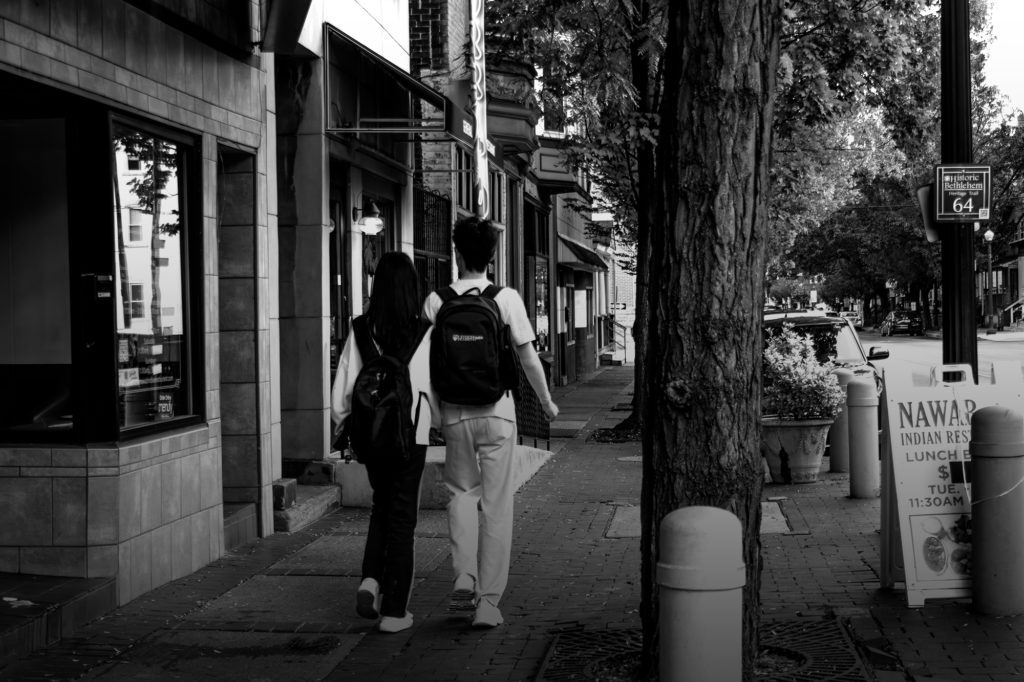
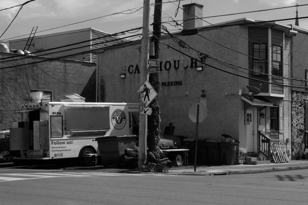
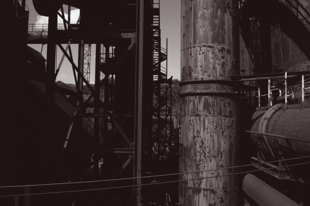
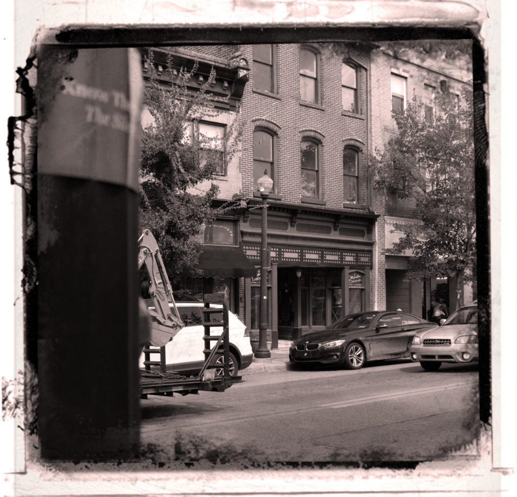
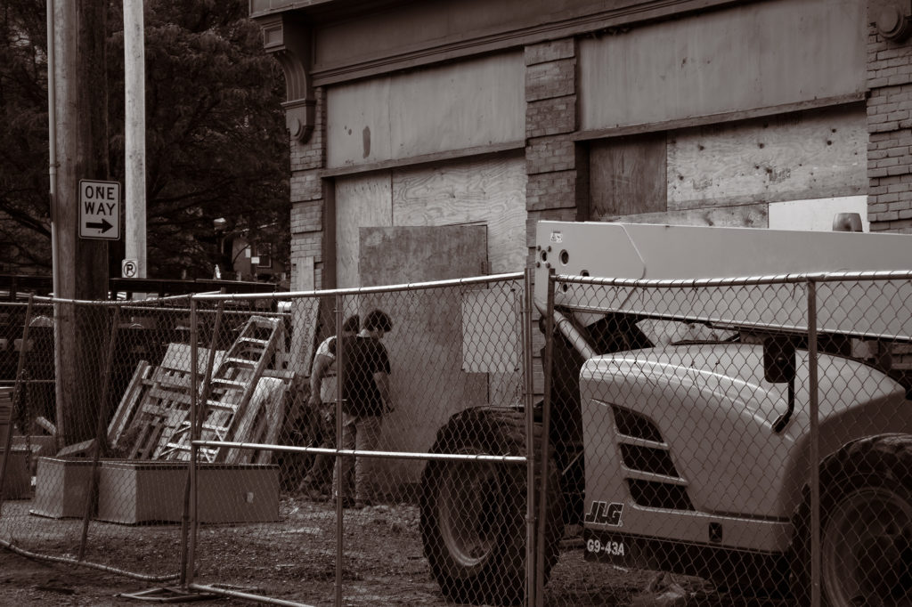
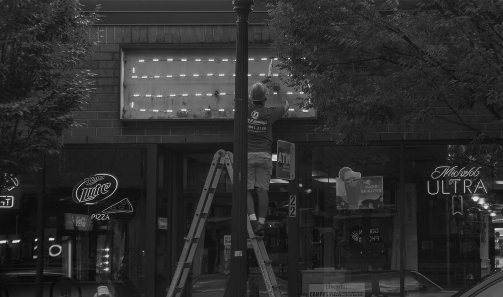
It seems like most of the photos give us a peak of what daily life is in Bethlehem of any small city. The way the photos are composed is as if I walked by an interesting scene. The saturation and gradient map photos especially struck a cord as familiar in a sense. The way that you concentrated on separating the lighter parts of the photos from the darker parts in a way that still encases the details of the photo is really impressive!

I really loved your colorization and color grading photos, Ernesto. The colorization was nice because the color was so low-toned but also stood out really well at the same time; it was intriguing to the eye because bright and easily colored areas are usually used with this technique but I prefer this more honestly. I also liked the duotone photo and am curious about which colors you added in? I thought possibly a deep maroon/purple and dark blue but Im not sure.
It seems like most of the photos give us a peak of what daily life is in Bethlehem of any small city. The way the photos are composed is as if I walked by an interesting scene. The saturation and gradient map photos especially struck a cord as familiar in a sense. The way that you concentrated on separating the lighter parts of the photos from the darker parts in a way that still encases the details of the photo is really impressive!